您现在的位置是:网站首页> 编程资料编程资料
CSS3 实现的定价表基于js+css3文章列表喜欢点赞按钮特效源码CSS3实现的登录框表单浮动占位符和提交按钮发光特效源码CSS3 SVG表情图标评论交互特效源码可切换的精美CSS3登录注册表单特效鼠标悬停图文列表css3动画特效代码CSS3实现的常见问题列表布局特效源码CSS3实现发光按钮登录表单特效代码Html5+CSS3+EL表达式问题小结CSS3注册表单文本框占位符特效源码jQuery带宽测速仪表盘特效实例
 2023-10-16
387人已围观
2023-10-16
387人已围观
简介 这篇文章主要介绍了CSS3 实现定价表的示例代码,帮助大家更好的理解和学习使用css3,感兴趣的朋友可以了解下
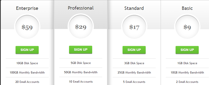
实现效果:
实现代码
html
css3
body{ background: #303030; } #pricing-table { margin: 100px auto; text-align: center; width: 892px; /* total computed width = 222 x 3 + 226 */ } #pricing-table .plan { font: 12px 'Lucida Sans', 'trebuchet MS', Arial, Helvetica; text-shadow: 0 1px rgba(255,255,255,.8); background: #fff; border: 1px solid #ddd; color: #333; padding: 20px; width: 180px; /* plan width = 180 + 20 + 20 + 1 + 1 = 222px */ float: left; position: relative; } #pricing-table #most-popular { z-index: 2; top: -13px; border-width: 3px; padding: 30px 20px; -moz-border-radius: 5px; -webkit-border-radius: 5px; border-radius: 5px; -moz-box-shadow: 20px 0 10px -10px rgba(0, 0, 0, .15), -20px 0 10px -10px rgba(0, 0, 0, .15); -webkit-box-shadow: 20px 0 10px -10px rgba(0, 0, 0, .15), -20px 0 10px -10px rgba(0, 0, 0, .15); box-shadow: 20px 0 10px -10px rgba(0, 0, 0, .15), -20px 0 10px -10px rgba(0, 0, 0, .15); } #pricing-table .plan:nth-child(1) { -moz-border-radius: 5px 0 0 5px; -webkit-border-radius: 5px 0 0 5px; border-radius: 5px 0 0 5px; } #pricing-table .plan:nth-child(4) { -moz-border-radius: 0 5px 5px 0; -webkit-border-radius: 0 5px 5px 0; border-radius: 0 5px 5px 0; } /* --------------- */ #pricing-table h3 { font-size: 20px; font-weight: normal; padding: 20px; margin: -20px -20px 50px -20px; background-color: #eee; background-image: -moz-linear-gradient(#fff,#eee); background-image: -webkit-gradient(linear, left top, left bottom, from(#fff), to(#eee)); background-image: -webkit-linear-gradient(#fff, #eee); background-image: -o-linear-gradient(#fff, #eee); background-image: -ms-linear-gradient(#fff, #eee); background-image: linear-gradient(#fff, #eee); } #pricing-table #most-popular h3 { background-color: #ddd; background-image: -moz-linear-gradient(#eee,#ddd); background-image: -webkit-gradient(linear, left top, left bottom, from(#eee), to(#ddd)); background-image: -webkit-linear-gradient(#eee, #ddd); background-image: -o-linear-gradient(#eee, #ddd); background-image: -ms-linear-gradient(#eee, #ddd); background-image: linear-gradient(#eee, #ddd); margin-top: -30px; padding-top: 30px; -moz-border-radius: 5px 5px 0 0; -webkit-border-radius: 5px 5px 0 0; border-radius: 5px 5px 0 0; } #pricing-table .plan:nth-child(1) h3 { -moz-border-radius: 5px 0 0 0; -webkit-border-radius: 5px 0 0 0; border-radius: 5px 0 0 0; } #pricing-table .plan:nth-child(4) h3 { -moz-border-radius: 0 5px 0 0; -webkit-border-radius: 0 5px 0 0; border-radius: 0 5px 0 0; } #pricing-table h3 span { display: block; font: bold 25px/100px Georgia, Serif; color: #777; background: #fff; border: 5px solid #fff; height: 100px; width: 100px; margin: 10px auto -65px; -moz-border-radius: 100px; -webkit-border-radius: 100px; border-radius: 100px; -moz-box-shadow: 0 5px 20px #ddd inset, 0 3px 0 #999 inset; -webkit-box-shadow: 0 5px 20px #ddd inset, 0 3px 0 #999 inset; box-shadow: 0 5px 20px #ddd inset, 0 3px 0 #999 inset; } /* --------------- */ #pricing-table ul { margin: 20px 0 0 0; padding: 0; list-style: none; } #pricing-table li { border-top: 1px solid #ddd; padding: 10px 0; } /* --------------- */ #pricing-table .signup { position: relative; padding: 8px 20px; margin: 20px 0 0 0; color: #fff; font: bold 14px Arial, Helvetica; text-transform: uppercase; text-decoration: none; display: inline-block; background-color: #72ce3f; background-image: -moz-linear-gradient(#72ce3f, #62bc30); background-image: -webkit-gradient(linear, left top, left bottom, from(#72ce3f), to(#62bc30)); background-image: -webkit-linear-gradient(#72ce3f, #62bc30); background-image: -o-linear-gradient(#72ce3f, #62bc30); background-image: -ms-linear-gradient(#72ce3f, #62bc30); background-image: linear-gradient(#72ce3f, #62bc30); -moz-border-radius: 3px; -webkit-border-radius: 3px; border-radius: 3px; text-shadow: 0 1px 0 rgba(0,0,0,.3); -moz-box-shadow: 0 1px 0 rgba(255, 255, 255, .5), 0 2px 0 rgba(0, 0, 0, .7); -webkit-box-shadow: 0 1px 0 rgba(255, 255, 255, .5), 0 2px 0 rgba(0, 0, 0, .7); box-shadow: 0 1px 0 rgba(255, 255, 255, .5), 0 2px 0 rgba(0, 0, 0, .7); } #pricing-table .signup:hover { background-color: #62bc30; background-image: -moz-linear-gradient(#62bc30, #72ce3f); background-image: -webkit-gradient(linear, left top, left bottom, from(#62bc30), to(#72ce3f)); background-image: -webkit-linear-gradient(#62bc30, #72ce3f); background-image: -o-linear-gradient(#62bc30, #72ce3f); background-image: -ms-linear-gradient(#62bc30, #72ce3f); background-image: linear-gradient(#62bc30, #72ce3f); } #pricing-table .signup:active, #pricing-table .signup:focus { background: #62bc30; top: 2px; -moz-box-shadow: 0 0 3px rgba(0, 0, 0, .7) inset; -webkit-box-shadow: 0 0 3px rgba(0, 0, 0, .7) inset; box-shadow: 0 0 3px rgba(0, 0, 0, .7) inset; } /* --------------- */ .clear:before, .clear:after { content:""; display:table } .clear:after { clear:both } .clear { zoom:1 }以上就是CSS3 实现的定价表的详细内容,更多关于CSS3 定价表的资料请关注其它相关文章!
相关内容
- CSS实现的圆形进度栏CSS3点击按钮圆形进度打钩效果的实现代码Vue.js圆形CSS3颜色渐变色拾取器css圆形镂空(优惠券背景图)的实现CSS3绘制酷炫霓虹灯圆环圆点加载动画特效基于css3制作的圆形透明画中画视频播放特效CSS3制作圆形滚动进度条动画的示例纯CSS3制作的圆形修边渐变按钮动画特效源码css 实现圆形渐变进度条效果的示例代码纯CSS3制作圆形渐变的按钮悬停ui特效源码
- 详解CSS 文字装饰 text-decoration & text-emphasisCSS中的下划线text-decoration属性使用进阶解决Dreamweaver中关于应用CSS的小问题
- html+css合并表格边框的示例代码HTML table 表格边框的实现思路html做表格只显示表格的外边框有关HTML表格边框的设置小技巧CSS实现表格细边框的两种方法css控制表格细边框样式表格边框以虚线显示的css样式ie6 表格td中无内容时不显示边框的解决办法HTML table表格边框的控制详细说明用CSS设置表格Table的细边框的比较好用的方法 HTML表格边框的控制实现代码
- 看图猜成语 撞钟敲鼓 答案是什么成语_手机游戏_游戏攻略_
- 疯狂猜成语 笑脸手指花和火 答案是什么成语_手机游戏_游戏攻略_
- 全民英雄 致歉礼包怎么领 致歉礼包里有什么_手机游戏_游戏攻略_
- 全民飞机大战微信版送萌宠_全民飞机大战西西宠物获得方法_手机游戏_游戏攻略_
- 全民飞机大战提升战斗力途径方法_全民飞机大战战斗力怎么提升_手机游戏_游戏攻略_
- 天天飞车ios版高分技巧心得十条_手机游戏_游戏攻略_
- 全民飞机大战体力闪电获得方法_手机游戏_游戏攻略_